

Overview
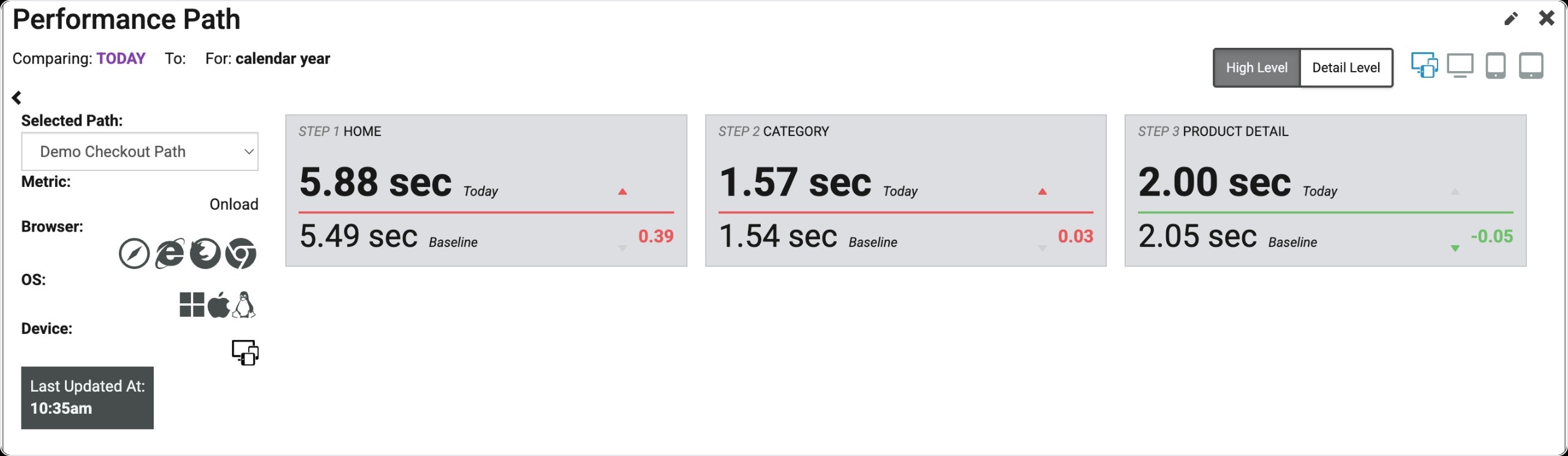
The Performance Path widget gives you a view of how your critical purchase path or customer journey is performing for real users, compared to a baseline. Like the KPI Date Comparison widget, there are a number of comparisons you can configure this widget for. See the Types of Comparisons section of this article for more details.
Requirements
In order to configure a Performance Path widget, you'll need to have first created a Real User Path. To complete this, go to the Real User Paths page.
Find Widget
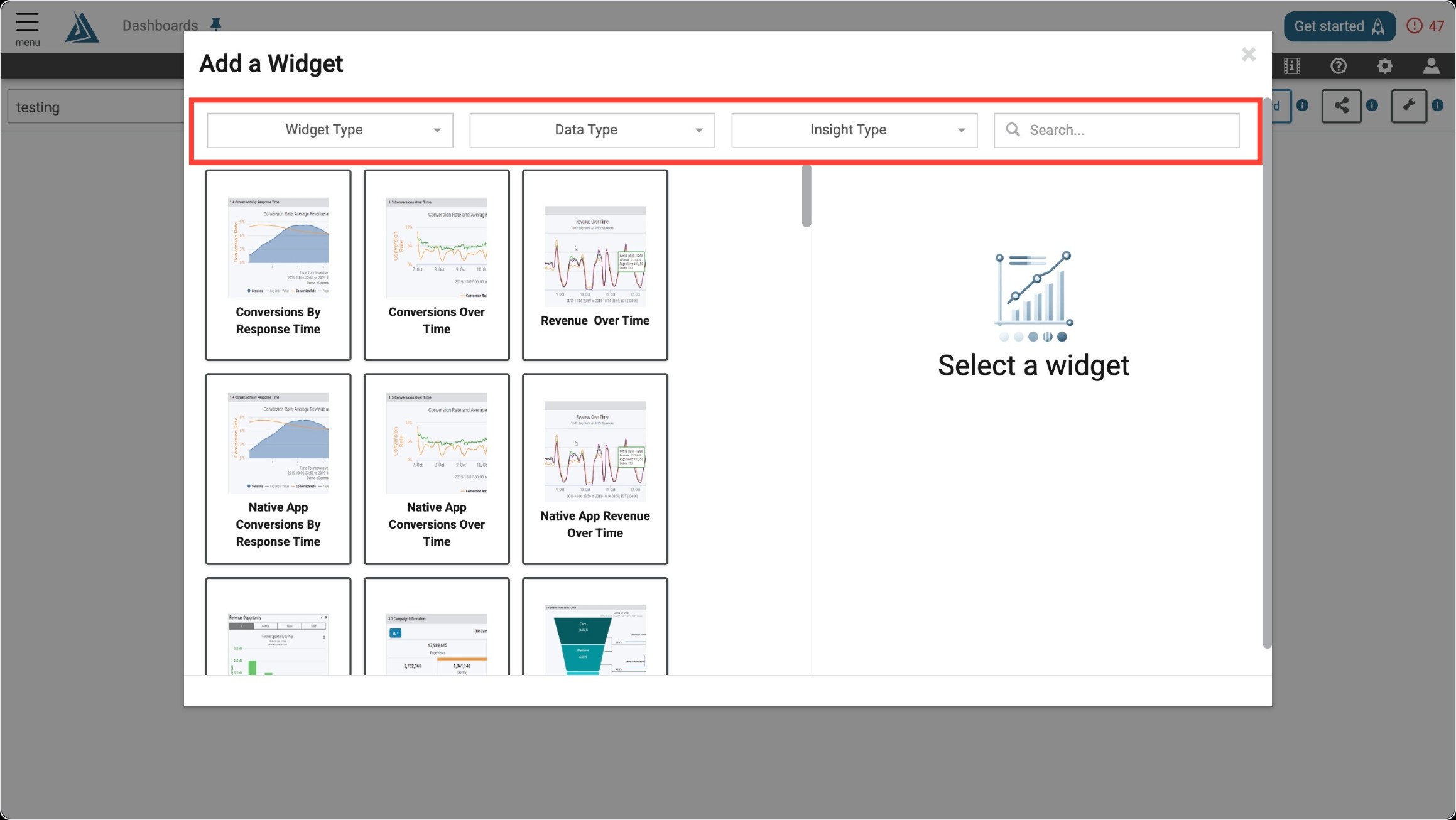
Once you enter the Add a Widget menu, you will see a variety of filter options on top. One way to find the Performance Path Widget is to use the filter options listed below.
|
Filter Title |
Filter Option |
|---|---|
|
Widget Type |
Summaries |
|
Data Type |
Real User |
|
Insight Type |
Performance |
|
Data Origin |
Browser Only |
Note: the Data Origin filter is only visible once the Data Type has been chosen.
Another way to find the Performance Path Widget is to use the search bar at the top right of the menu.
Widget Configuration
To configure this widget once it is selected, fill out all required sections, select the path or paths you would like to monitor, add any additional filtering, and most importantly, select the type of comparison under Comparing Today To. If you are unsure what the comparison types mean, see the Types of Comparisons section of this article.
Types of Comparisons
There are 3 different types of comparison with this widget. Depending on which is selected, there will be more options to specify the details.
|
Comparison Types |
Description |
|---|---|
|
Same Day Last Month |
Compares data from today with data retrieved on the same day of the previous month. |
|
Same Day Last Year |
Compares data from today with data retrieved on the same day of the previous year. |
|
Custom Selector |
Allows users to choose a custom time in days or weeks to compare data to (Ex: Past 4 days or past 2 weeks). |
Path Overview Metrics
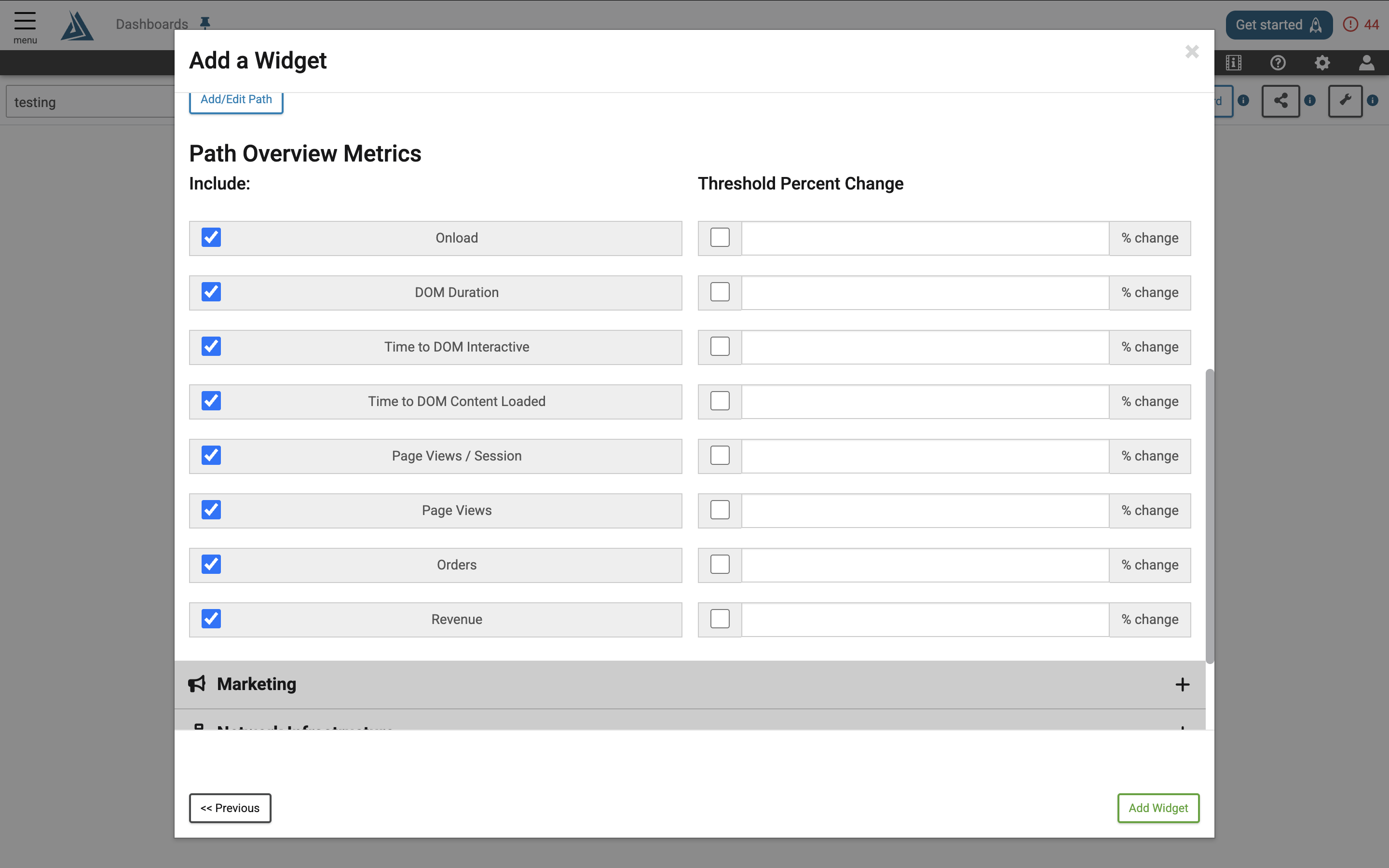
Path Overview Metrics allows you to configure the information that will be displayed within the widget including the Threshold Percent Change. Click on the check boxes on the left side of the metrics to toggle them on and off.
|
Threshold Percent Change: If the current value deviates from the baseline greater than the specified percentage, the area in the widget with the metric will appear red. This only affects the "Detail Level" tab of the widget. |
About the Performance Path Widget
Widget Controls
On the left side of the widget, you will see your device filtering, the displayed metric, and a selector for the chosen path or paths. If the widget is set up with more than one path, you can change the path displayed in the Selected Path drop down menu.
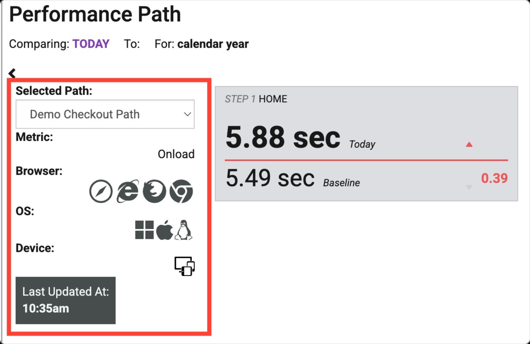
Toggle between the High Level view and the Detail Level view by clicking the buttons in the top right.
In the High Level view, the widget is filterable by device. You can only choose one device at a time. Click on the device you would like to see data from.
|
Device |
Icon |
|---|---|
|
All Devices |
|
|
Desktop |
|
|
Mobile |
|
|
Tablet |
|
High Level View
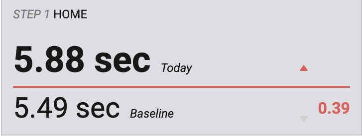
This view displays a card for each step in the path containing the average number for today on the top and the baseline on the bottom. To the right you'll see a delta, color-coded in green for better performance and red for worse performance, today versus the baseline.
Detail Level View
Detail Level Overview
The Detail Level is divided into 3 sections:
Path Level (Top Section)
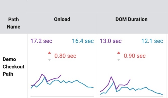
The Path Level displays the Path Overview Metrics, set in widget configuration. Each cell represents one metric with a purple trend line for today's data and a blue trend line for the baseline comparison data.
The purple number in the top left displays the average/total for today and the blue number in the top left shows the average/total for the baseline.
The red or green number in the middle is a delta. Green demonstrates an improvement and red demonstrates a decline.
The numbers represented in the performance metrics (Onload, DOM Duration, Time to DOM Interactive, Time to DOM Content Loaded) represent the sum of the averages for each step in the path.
The Path level Onload represents the sum of the average Onload for each step in the path. The same is true of the other performance numbers (DOM Duration, Time to DOM Interactive, and Time to DOM Content Loaded). The Pages per Session, Page Views, Orders and Revenue are all calculated at the path level.
Device Level (Middle Section)
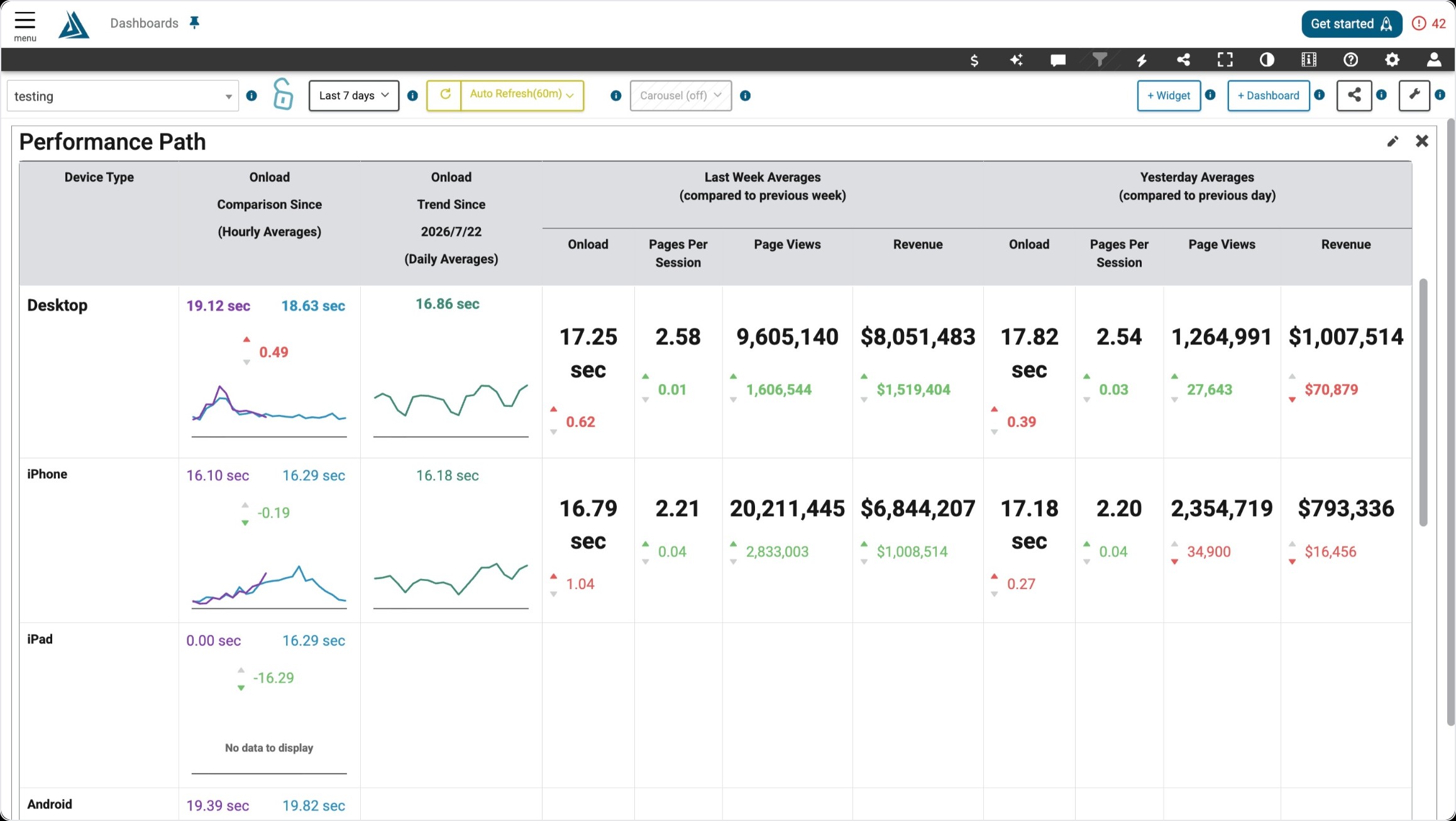
The Device Level shows the information at the path level broken down by device
Step/Page Level (Bottom Section)
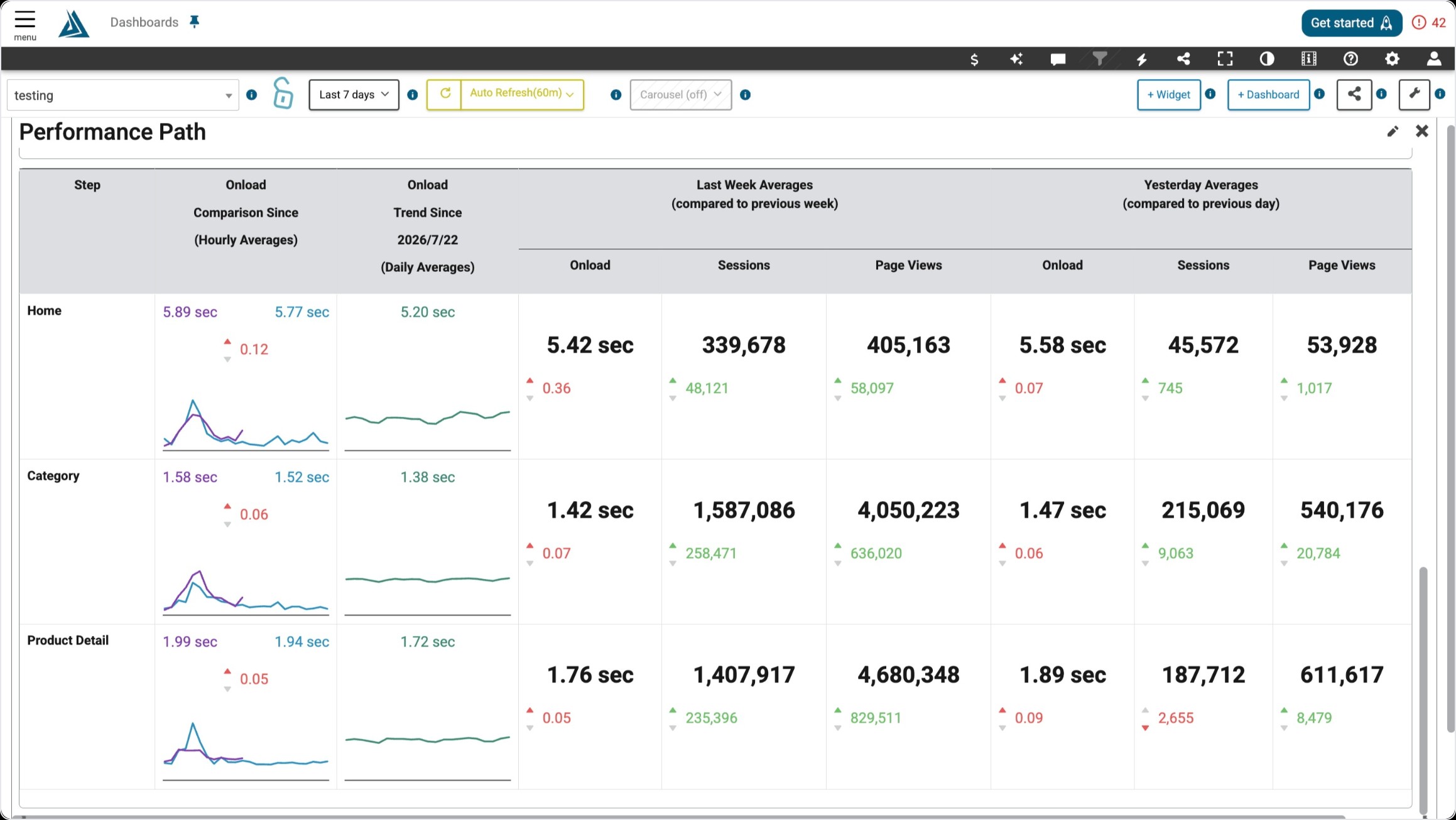
The Step/Page level shows the data filtered by path and device, broken down by step.
Best Practices with the Performance Path Widget
This widget works optimally when it's the only dashboard widget in your dashboard.
Due to the large amount of information displayed in the Performance Path widget, it is helpful to expand the widget as tall and wide as the screen will allow.