

Overview
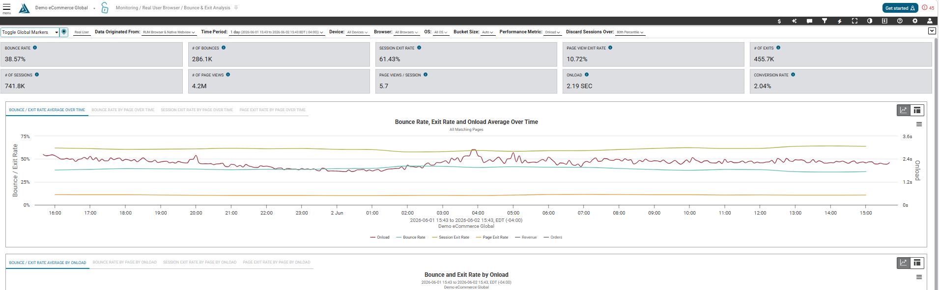
The Bounce & Exit Analysis page helps quantify the impact page load time has on your customer’s experience .
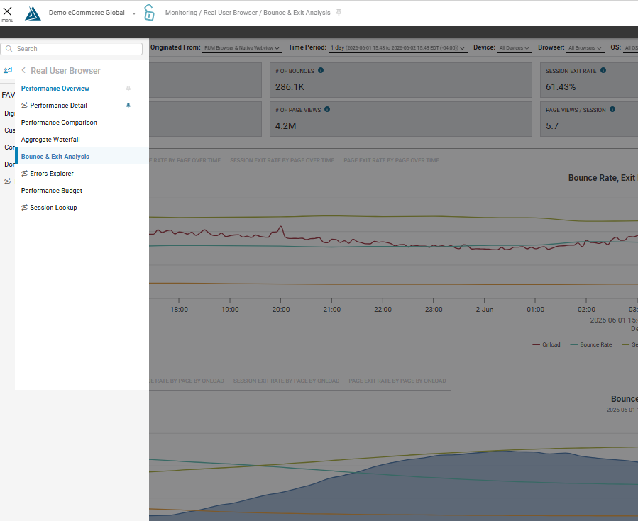
How to Find the Bounce and Exit Analysis Page.
To find the RUM Bounce and Exit Analysis Page go to the main navigation on the left, go to Real User Monitoring, Web Browser, and click on Bounce & Exit Analysis
How to Navigate the RUM Bounce and Exit Analysis Page
Metrics Summary
At the top you will see a summary of metrics showing you bounce and exit rate information, page views, conversion rate, page speed and more.

Notice both the Session Exit Rate and a Page View Exit rate. The Session exit rate is calculated by the number of visitor sessions that left your site. The Page View exit rate is calculated by the total number of page views and the total number of exists. Read over the tool tips for more information.
Graphs Over Time
The first section of graphs show bounce and exit rate percentages over time. You can switch between graphs by selecting the tabs above the graph.
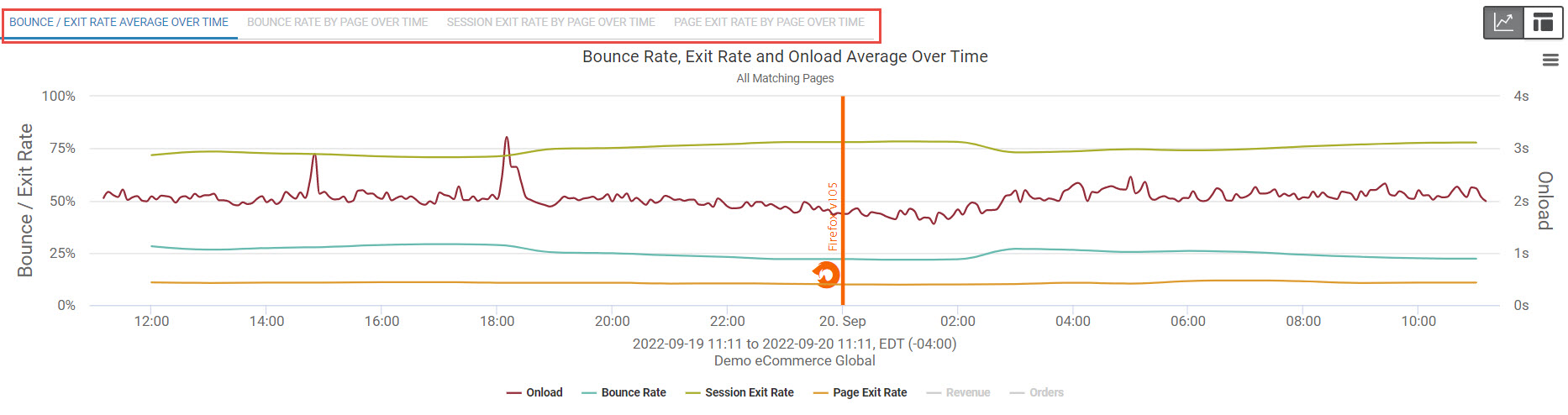
The first graph here shows the average bounce and exit rate over time for all pages. You can also see onload, revenue and orders on this graph for more context. To switch to a table view, click the button on the top left of the graph.
Graphs by Onload
Moving down the page, the next section of graphs show a histogram of bounce and exit rate by onload time. Switch between the different graphs by selecting from the tabs above the graphs. Bounce and Exit Rate is here on the y axis and page onload time is here on the x axis.
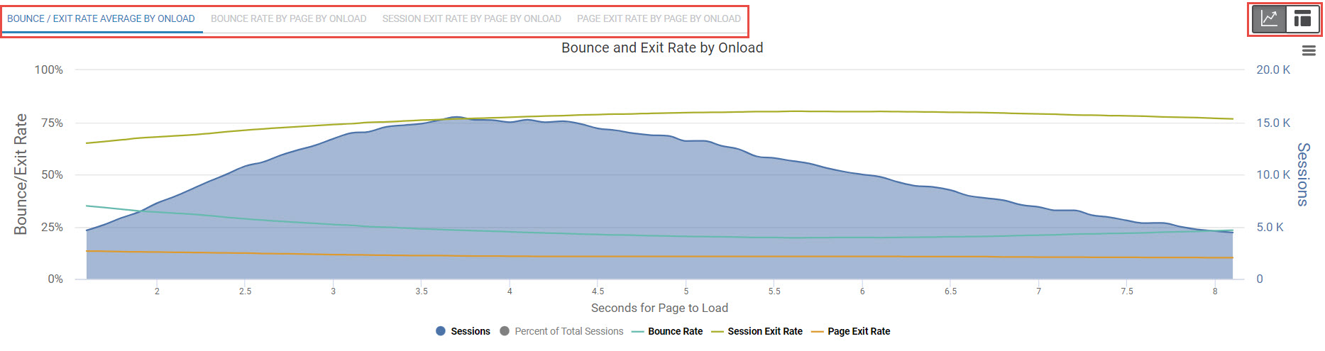
This view gives you great insight into how performance is affecting your user’s experience. To switch to a table view, click the button on the top right of the graph.
Bounce Rate and Onload Table
At the bottom of the page we have the Bounce Rate and Onload table.

This shows you the daily averages for bounce rate and onload for the past 7 days, and the average for the past 30 days at the far right. The daily numbers will appear in red if they are 15% worse than the 30 Day Average and green if they are 15% better than the daily average.
Filters
Lastly, use the filters to customize your analysis by clicking at the top of the page, or by clicking the filter icon and using the filters menu.