

Overview
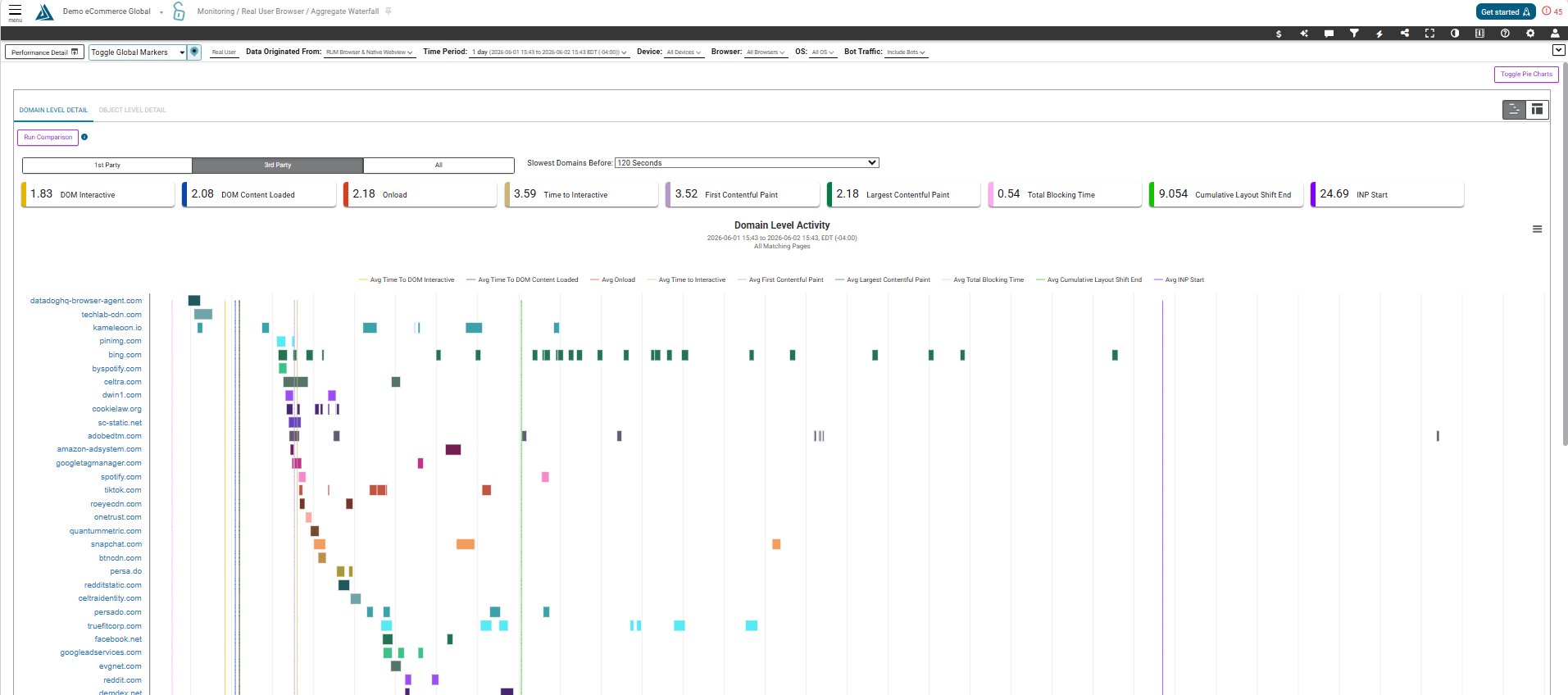
While the Performance Detail Page can show us the object and domain level detail for a single page measurement, the Aggregate Waterfall Page shows this data aggregated over time.
Note: This page has the same features and functionality as the Aggregate Waterfall page in Synthetic Monitoring.
How to Find the RUM Aggregate Waterfall Page
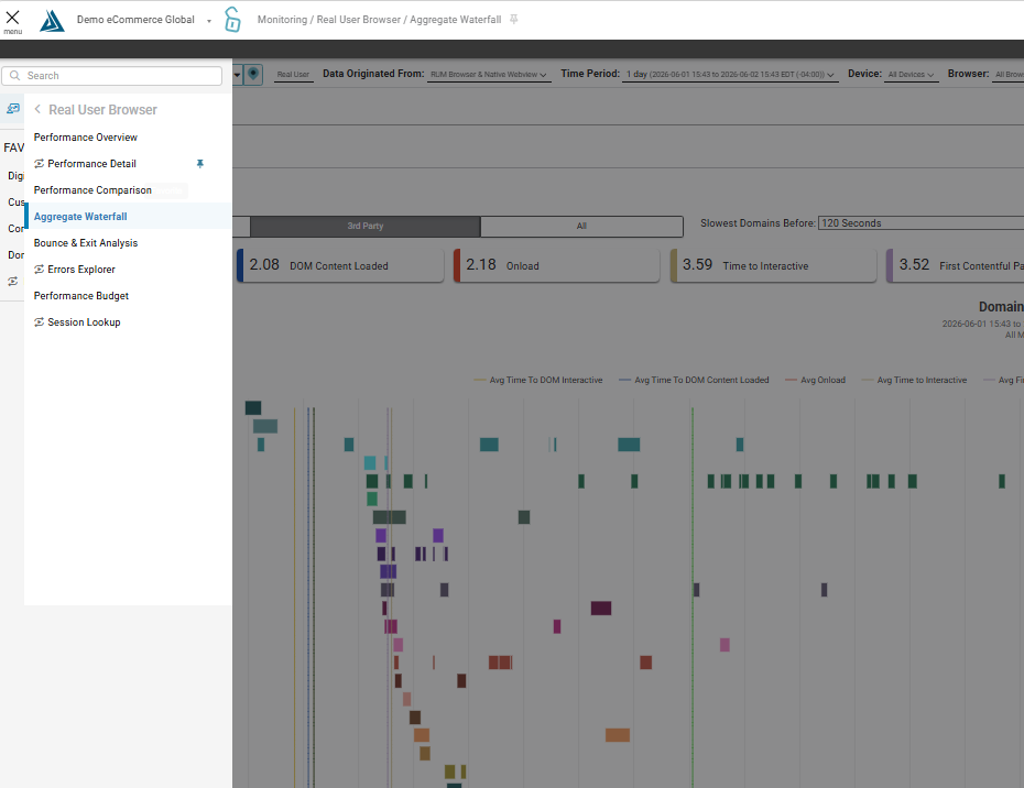
The RUM Aggregate Waterfall Page is accessible through the left side hamburger menu under Monitoring, then Real User Browser, then Aggregate Waterfall
How to Navigate the RUM Aggregate Waterfall Page
Domain Level Detail
The first thing on this page is the Domain Level Activity Waterfall. This graph is formatted as a waterfall, depicting the amount of time each domain was loading on average during the time period.
You can also view this data in a table format by toggling the graph and table icons on the right hand side. In the table view you will see % Impact, % of Onload Activity, Impact Score, and Tag Quality.
This is the breakdown for the Impact score:
-
50% < frown face
-
10-15% < neutral face < 50%
-
Smile face < 10-15%
In the table view, you are able to open an expanded graph view of that domains timings over time through the icon on the left side of the table.
Object Level Detail
This waterfall displays the amount of time each object call spent loading, on average, during the selected time period. Switch between this graph and the Domain Level Activity Waterfall by clicking these tabs at the top of the page.
Toggle between the waterfall view and table view of this data using the icons indicated in the screenshot below.
In this view, you are able to open an expanded graph view of that resource timings over time through the icon on the left side of the table.
Resource Timings by File Table
At the bottom of the page is a table breaking down the resource timings by file. Here we can see which domain each resource belongs to, how many times this resource was observed (or element count), and more timing information.
Pie Charts
To toggle the pie charts click the button at the top right of the page.
Running Comparisons
Back at the top of the page, there is a “Run Comparison” button. This allows you to compare two different waterfalls using the filter options in the menu. To do this, click the button and change the desired filter options for comparison which will be comparing against the data already on the page.
Once filtering selections are ready, click Apply Filters for Comparison. The comparison graph will load to the right. We also see a summary in the middle showing What’s Changed.
Below are two tables, one showing the duration for each item and the other showing the element count for each item. Toggle these tables with the button indicated in the screenshot below.