
Preview:
Summary:
The Bounce Rate Report shows you the relationship between bounce rate and performance on your site.
How to Configure a Bounce Rate Report
To configure a Bounce Rate Report, follow along with the wizard. You may notice some new options once you get to step 4 - Report Filters. So here they are along with their definitions and some details you may find helpful.
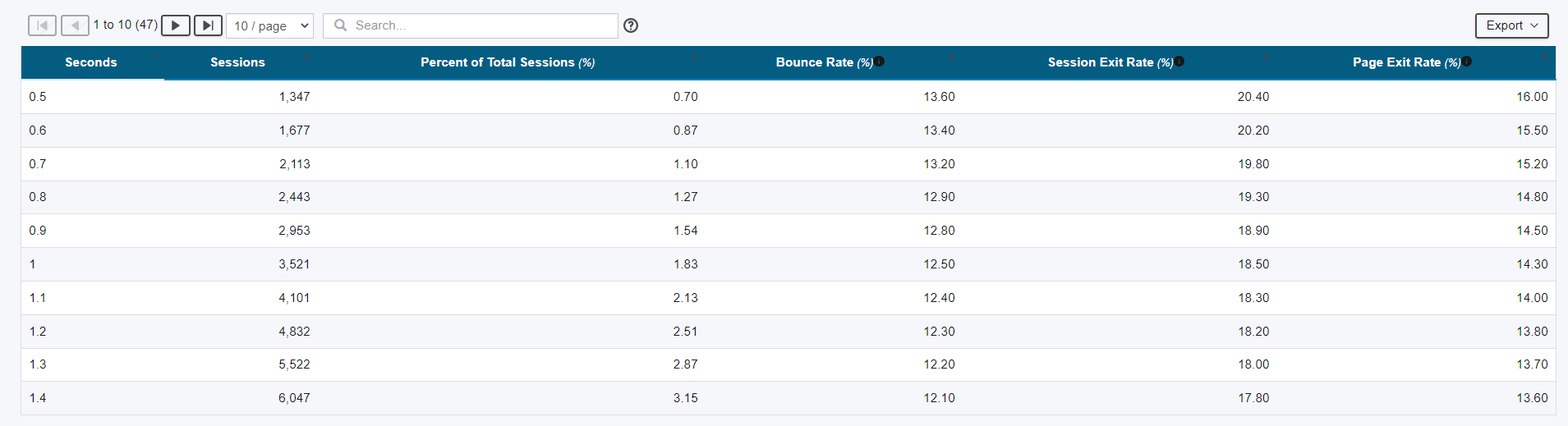
Granularity: This is the degree of detail shown in the graph. With this report, you'll be getting a histogram where the x axis is performance in seconds and the y axis is bounce rate. This setting controls the detail of the x axis, for example, whether the data point goes from 1 to 2 seconds, 1 to 1.5 seconds or 1 to 1.1 seconds.
Discard Sessions Over: This gives you the ability to filter data outside of the 90th percentile, for example. This is very helpful for tuning the report to give you the best representation of your user behavior while filtering out the noise and outliers.
How to Analyze the Bounce Rate Report
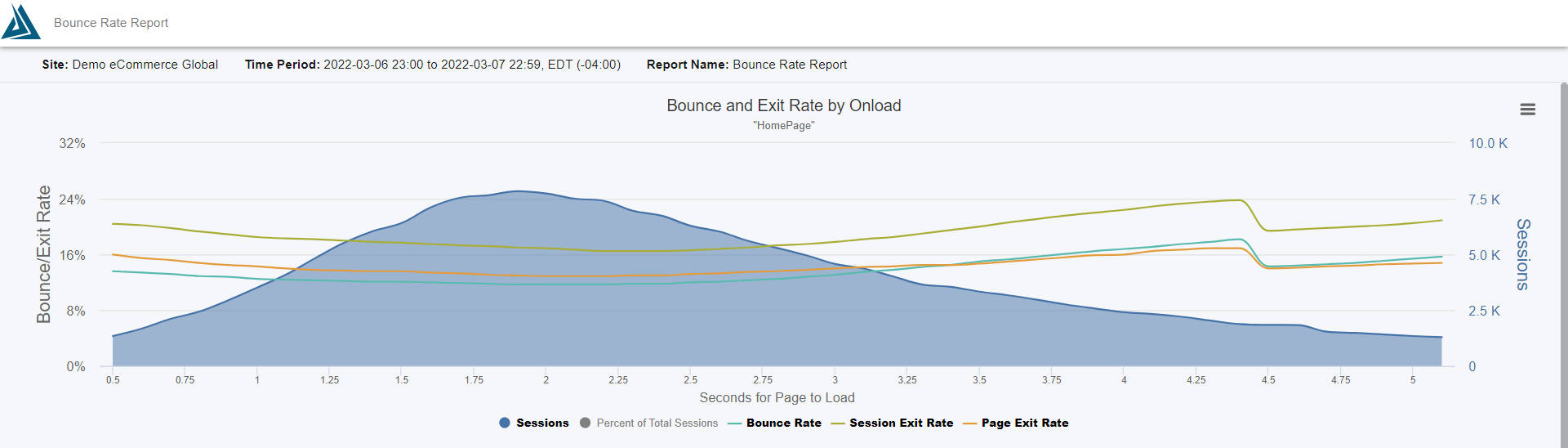
The Bounce Rate Report gives you insight into the relationship between bounce rate and performance on your site. The x axis is page load time and the y axis is bounce rate. The typical shape of this curve indicates bounce rate increases as page speed increases. And vice versa - the quicker the page loads, the lower the bounce rate.
The shaded region is a histogram of sessions where each 0.1 second cohort represents the number of visitors who received the page at x seconds.
In addition to bounce rate and sessions, this graph also shows average page views/session. You can toggle these lines on and off in the graph by clicking them in the legend.
For context, see the time period listed in the graph subtitle above the legend, and below the graph to the left you can find the selected filter options - including site, traffic segment, page name(s) and more.
Comments
0 comments
Please sign in to leave a comment.