
Summary
The Performance Report shows you a trend of all performance metrics for the real user or synthetic performance on your site.
Using Real User data:
Using Synthetic data:
Performance Trend Graph
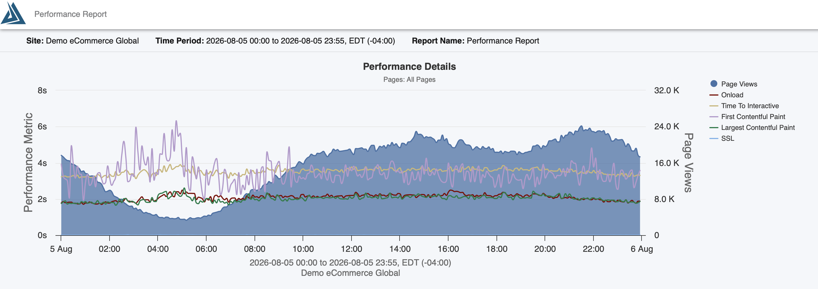
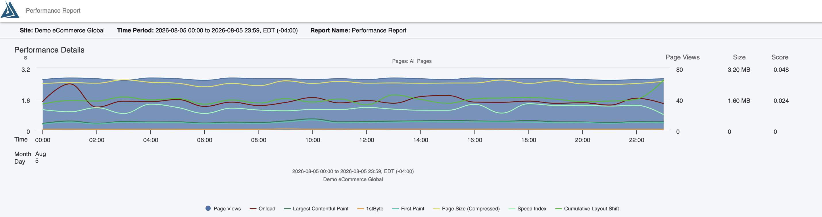
The performance graph shows all of the metrics for your real user or synthetic data trended over the specified time period. The shaded blue area represents the session volume over time. The y-axis shows seconds and you can see how your metrics compare - Onload, DomComplete, Time to DOM Content Loaded, etc.

Performance Trend Table
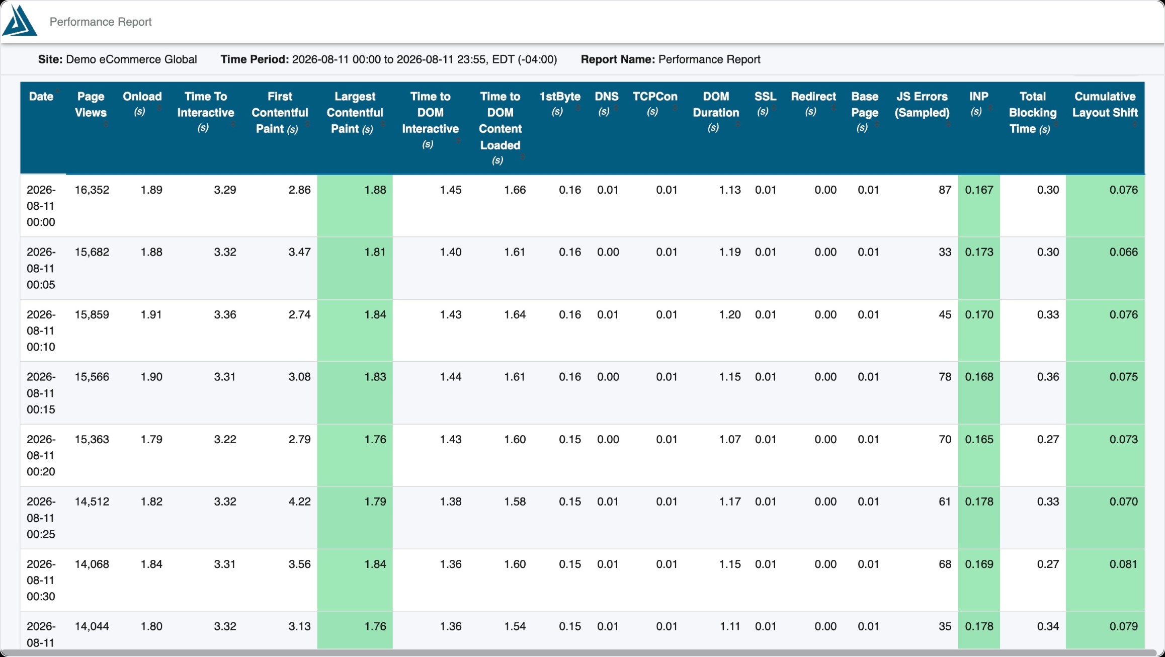
The table at the bottom of the report offers you the exact same data from the graph above in a table. Here you can see the value of each metric in the graph over each time bucket, in this case, each hour.