Summary
The “Data Science Insights” page is a powerful graph creation tool which provides insightful data with just a few clicks. In addition, it allows for side-by-side comparisons to better deep-dive into your site’s data.
In this article, learn:
- How to Create Custom Basic Line Graphs
- How to Create Line Graphs Grouped By Selected Filters Using the Custom Graph Wizard
- How to Create a Graph Comparing 2 Different Time Ranges
- How to Compare 2 Graphs Side-By-Side
- How to Create Custom Histogram Graphs
- How to Build Custom Scatter Plot Graphs
How to Create Custom Basic Line Graphs
- Click on the "+ New Custom Graph" button in the center of the screen.

- Select the data type you wish to use for your analysis (for this example, we will use Real User data).

- Select “Line Graph” from the list of options.

- Select any or all of the “Displayed Metrics” you wish to view on the graph
(there are different options for Real User and Synthetic data types).
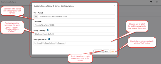
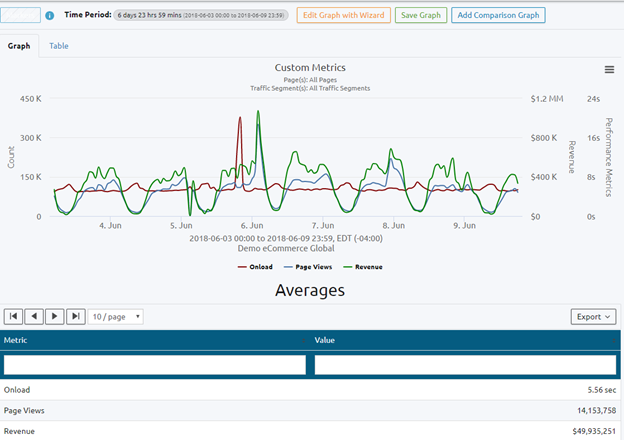
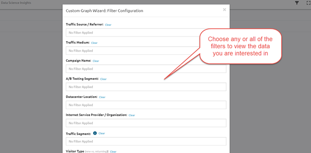
- (Optional) Apply filters to the data then click "Go!" to build your graph.


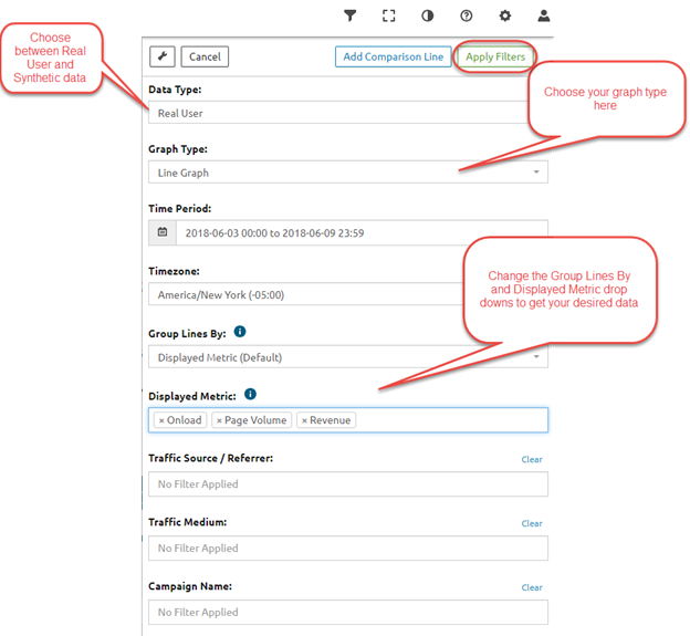
Alternatively, you can skip the wizard and click on the filters button at the top right of the screen, then click “Apply Filters” to build your graph.


How to Create Line Graphs Grouped By Selected Filters Using the Custom Graph Wizard
- Click on the “+ New Custom Graph” button in the center of the screen.

- Select the data type you wish to use for your analysis (for this example, we will use Real User data).

- Select “Line Graph” from the list of options.

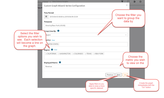
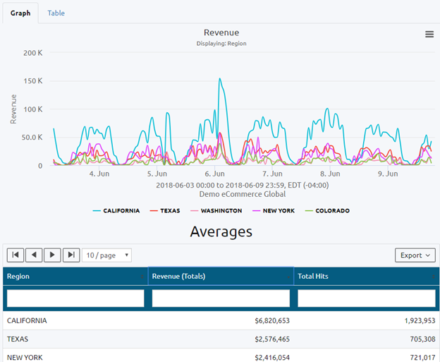
- Choose the “Group By” you wish to view. In this example, we will be grouping by selected regions within the United States.

How to Create a Graph Comparing 2 Different Time Ranges
- Follow one of the previous guides to get to the “Filters” screen, or simply press the Filters Button at the top right of the page.

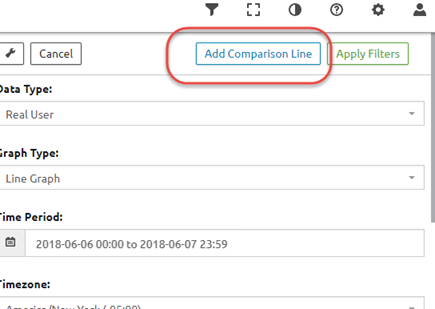
- Click the “Add Comparison Line” at the top of the filters.
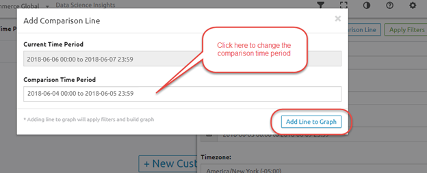
- Choose the date you wish to compare against, then click “Add Line to Graph” to create the comparison graph.
NOTE: this will compare against the date which you selected in a previous step. To change that date, you will need click “X” at the top of the screen to go back to the filters.

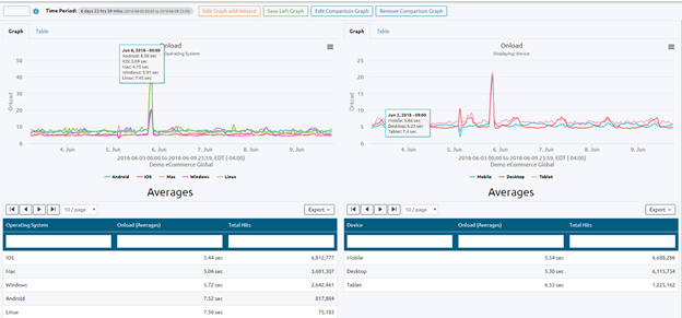
How to Compare 2 Graphs Side-By-Side
- Create any graph of your choosing (see previous guides).
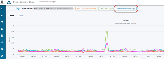
- Click the “Add Comparison Graph” button located at the top of the screen.
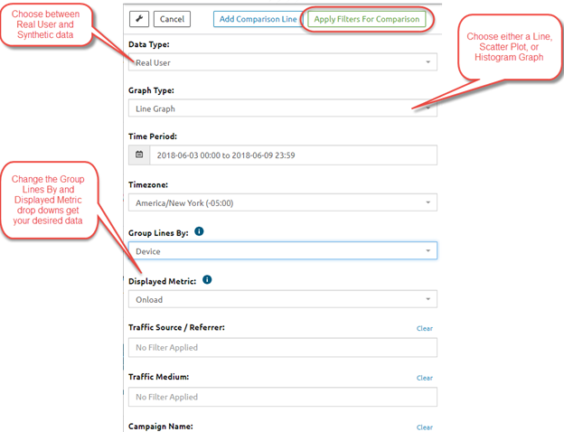
- Select the Data Type, Graph Type, Time Period, and the rest of your filters, then click “Apply Filters For Comparison” at the top of the filters list.
How to Create Custom Histogram Graphs
- Click on the “+ New Custom Graph” button in the center of the screen.

- Select “Real User” as your data type.

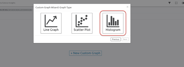
- Select “Histogram” as your graph type.
- Choose the data you wish to view on the graph then click "Go!"
How to Build Custom Scatter Plot Graphs
- Click on the “+ New Custom Graph” button in the center of the screen.

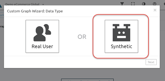
- Select the data type you wish to use for your analysis (for this example, we will use Synthetic data).
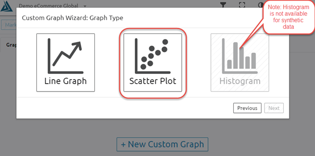
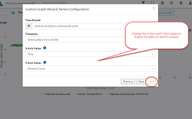
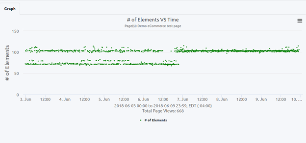
- Choose “Scatter Plot” from the list of graphs.
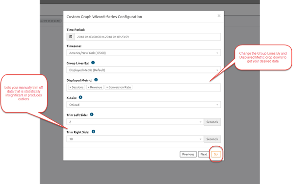
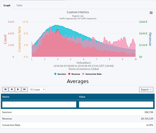
- Choose your X-Axis values and your Y-Axis values then click “Go!”

Comments
0 comments
Please sign in to leave a comment.